Buildings and surroundings
Our signage on our offices and warehouses identifies us to the outside world. It is one of the most elementary marks of our identity: it not only shows where we are but, by showing our trademark, also who we are.
The signage of the Van Leeuwen buildings merely consists of a huge version of our trademark. It shows our two basic trademark elements: the logotype (the ‘name’) and the symbol (the lions and shield). Because of its identifying value, the signage should be applied with the greatest care and consistency: we show our quality by showing ourselves in a unified manner to the world.
Therefore, we urge you to follow these guidelines in every detail. We have, as any company or person, only one chance to make a first impression; let us seize this opportunity and make it a good impression!
Versions
The signage can be applied in two versions:
One piece
If the background does not provide sufficient contrast, we use a sign in one piece (white base).

Detached
On backgrounds that provide sufficient contrast, we apply signing based on the trademark in its positive version in channel lettering.

Detached alternative
An alternative for channel lettering is that typography and symbol (lions and shield) may be milled from sublimated aluminium and fixed to the background. Thickness of the material is dependent on the size of the signing.
Ilumination
The signage is preferably illuminated. It may be illuminated from the inside or from the outside.
In order to create signage please follow the instructions displayed in the downloadable Design Manual (chapter Buildings and surroundings).
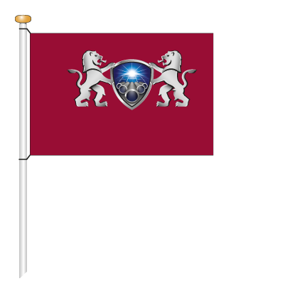
Flag 2,25 x 1,5 m
Size
2,25 x 1,50 m
Colors
Cyan, magenta, yellow, black

