Corporate trademark
The Van Leeuwen trademark consists of three elements: the lions, the shield, and the name ‘VAN LEEUWEN’.
The shield
The shield offers a traditional aspect in a new design. It symbolizes Van Leeuwen’s activities and services. The shield has a chrome rim and a deep blue, classic fill. Its triangular shape makes it dynamic and its content expresses entrepreneurship in the world of pipes and tubes. The radiant sun that emerges on the horizon of the globe symbolizes our company’s worldwide character: at any time, wherever the sun rises, Van Leeuwen companies are active. The tubes within the shield show a worldwide perspective: we sell pipes and tubes globally and know how they are used in every place in the world.
Logotype
The Van Leeuwen logotype is based on ITC Kabel with some adaptions on the previous logotype like a less sharp ‘W’. Kabel makes for a strong and discerning brand value because others rarely use it. It is a firm yet friendly type that provides the right association with Van Leeuwen and its strong roots.
Strong symbolics
The metallic design and colors of our trademark associate it with technology, industry and innovation. The colors and the lining provide depth. The space between the lions and the shield make a strong image. The metallic colors and the light in the shield freshen and activate the trademark.
Customized design
The trademark is to be used as a unified item always. It should always be used as one whole. The trademark (both the symbol and the typographic elements) are customized design. They may not be redrawn or altered.
Protected area
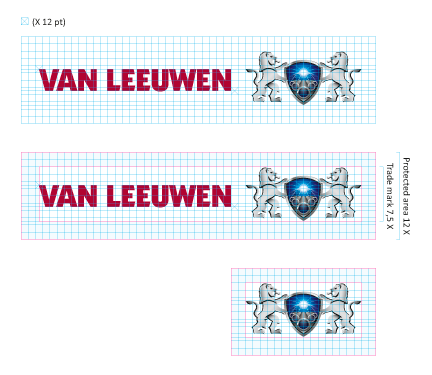
As shown here, a ‘protected area’ surrounds the trademark. Do not allow any other graphic elements or text inside this area. This rule holds especially when the trademark is given to partners that may use it for co-branding! Also, when positioning the trademark on an area or page, always place the entire protected area within the area or page. Never cut off inside the protected area. See ‘Versions’ in order to decide what type of trademark is to be used, e.g. full color or diapositive.
Fixed sizes
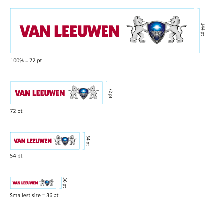
The size and position of the protected square area are fixed and may not be altered.
The smallest size of the trademark including its protected area is 50%, 36 pt. If a smaller size is needed, for instance on a pen, only the logotype ‘VAN LEEUWEN’ may be used with a minimum size that is derived from the minimum size of the trademark. Please consult Corporate Communications on this.
Versions
Full color version
The full color version with red logotype should be used whenever possible. The trademark may be printed in four or five colors: the red color is available in customized Van Leeuwen Red. All colors are strictly defined as full color build-ups. For the proportions and references of the colors, see page ‘Color’.
Diapositive version
The full color version should be used whenever possible. The diapositive (‘negative’) version with white logotype is only to be used when the full color version would be illegible, for instance on a (red) color or a photograph.
Three color version
The full color version is to be used whenever possible. If technical conditions, (such as print quality) or the size of the reproduction would lead to a poor result quality, but the trademark still has to be represented in a colored version, the three color version may be used. This version uses lines in stead of shaded grays and has no gradients in the colors.
Halftone grayscale version
The full color version should be used whenever possible. A halftone grayscale version is available when the use of color is impossible. The trademark should be used in black and halftone black on a white background.
Monochromatic
If only one color is possible, the line version of the trademark in black (without halftone black) on a black background is least preferred. Preferably use the trademark in black on a white background.
Square version
Experience taught us that in addition to our rectangular logo, a square edition is needed for specific cases in which the length of the logo causes problems. The square version can only be used subject to the following restrictions:
- Most importantly: it is only to be used (after approval) by Corporate Communications
- It is not to be used on print, like brochures, letter heads, etc.
- It is only to be used where the rectangular logo causes problems, e.g. on a cap, or a small business gift.
The square version trademark as shown here cannot be used (prototype). If you have a production where you think the square version of the logo is better suited, please contact Corporate Communications.
